
Listen to this blog

Every professional has been there: you spend hours, maybe days, deep in data analytics, running complex database queries, and building what you think is the ultimate performance report. You populate your slides with detailed regional margin analysis, five different pie charts, quarterly performance trends, and extensive revenue streams. You walk into a meeting with senior leadership, confident that your hard work speaks for itself.
Then, you see the room glaze over. Within minutes, a Vice President or a C-suite executive cuts you off and asks, “What is the actual bottom line here?”
Early in my career as a data and AI architect, I faced this exact bottleneck. I used to think that showing exhaustive data proved my technical expertise and value. But interacting with CTOs, team leads, and enterprise business leaders taught me a crucial lesson: leaders do not want more data; they want actionable items. When you speak to senior leadership, you are not there to show your work; you are there to drive a business outcome. If you want to accelerate your corporate growth and move up the organizational ladder, you must shift your mindset from being a data reporter to becoming a strategic data storyteller.
Executive Reality: The 5-Second Test Rule
To effectively change how you present numbers, you must understand the daily reality of a business leader. Whether navigating a massive multinational company or a lean startup, executives are severely time constrained. If a scheduled 20-minute presentation gets compressed into just 5 minutes, a leader is often thrilled.
Because time is short, executives view information through a strict five-second test rule. When a business leader looks at a slide or a dashboard, they spend exactly five seconds scanning it. Within those five seconds, the core message must be fully communicated. If they cannot understand the primary takeaway or the required decision immediately, the presentation fails the test, and you need to redesign your material.
Leaders use an aggressive mental filter to strip away background noise and find the strategic signal. To make sure your data passes this filter, you can apply three proven corporate communication frameworks to structure your data into a clear business narrative.
An interesting read: Popular AI-assisted Data Analytics Tools of 2026
1. The Minto Pyramid Principle: Lead with the Conclusion
The absolute gold standard for executive communication is the Minto Pyramid Principle, or top-down communication. Developed by Barbara Minto, the first female MBA hired by McKinsey & Company, this framework flips traditional storytelling on its head.
In day-to-day life, we naturally build up to a conclusion. We explain the background, outline the technical issues, walk through the data points, and finally deliver our recommendations at the very end. When presenting to busy executives, this approach backfires completely because they lose patience waiting for the point.
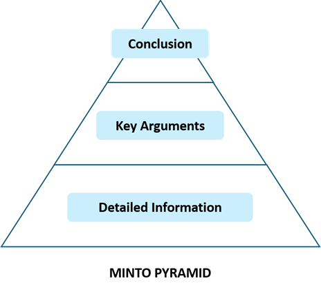
The Minto Pyramid Principle dictates that you start with the conclusion and drill down into the supporting data afterward. You throw out the core answer within the first 30 to 40 seconds of your conversation, then back it up with structured facts.
What Not to Do:
“Over the last six months, our server maintenance costs rose by 14%. We also noticed that user drop-off on our checkout page increased from 2% to 5%. Our development team ran some tests and found our database queries are lagging. Therefore, we need to migrate to AWS cloud hosting.”
By the time you finish setting that stage, the leader has checked out or lost focus because they are already dealing with a dozen other problems.
How to Structure It Instead:
Core Conclusion: We need to invest $150K to migrate our infrastructure to AWS cloud hosting this quarter to reclaim $1.2 million lost in annual revenue. *Supporting Data 1: Our current checkout page lags, triggering a 3% spike in user drop-off that is costing us $100K per month. *Supporting Data 2: Local infrastructure server maintenance costs are rising 14% every six months as the hardware ages, tightening our operational margins.
By leading with financial impact and clear resolution, you instantly capture their attention. You frame the discussion around revenue optimization, which is exactly what leadership cares about.
2. The SCR Framework: Build Corporate Urgency
When you want to pitch a brand-new feature, introduce an innovative product line, or propose a pivot, the Situation, Complication, Resolution (SCR) Framework is an incredible tool. Data by itself rarely motivates human action. The SCR framework builds a narrative that stitches the business landscape together, creating a healthy tension that makes your solution feel urgent and necessary.
This narrative relies on three simple parts:
| SCR Category | Description | Example |
|---|---|---|
| Situation | Establishing the current baseline reality of the business. | Our core enterprise software product has successfully captured a 35% market share, generating a solid $50 million in annual recurring revenue. |
| Complication | Introducing the critical bottleneck, market shift, or problem that disrupts the baseline. | First-quarter data shows our customer acquisition costs (CAC) have spiked by 42% because our primary market is reaching saturation. If we take no action, this spike will shrink our overall corporate margins by 8%. |
| Resolution | Offering a clear, data-backed plan to solve the complications. | We must launch a new, adjacent product line to capture fresh demand, which will lower our customer acquisition costs for that segment by 80%. We recommend reallocating 20% of our existing marketing budget to fund this beta test rollout. |
Read more: Top Skills You Need to Build a Career in Business Analytics
3. The Action Title Framework: Let Your Headers Do the Work
The final framework is highly effective for fast-moving executives who primarily read slide headers and ignore the rest of the text. It is called the Action Title Framework, and its rule is simple: never use generic, descriptive topic labels for your slide titles. Instead, convert every slide header into a standalone business insight.
Notice how shifting from a descriptive title to an action title completely changes the clarity of your message:
| Descriptive title | Action title |
|---|---|
| Customer Churn Rates | Customer Churn Spiked 12% in Q1 Due to Competitor Pricing Shifts |
| North American Sales Data | Enterprise Sales in North America Grew 25%, Offsetting Retail Declines |
| Web Traffic Breakdown | Mobile Traffic Exceeded Desktop for the First Time, Signaling a Mobile-First Shift |
If a leader only skims the top of your presentation document, they should still walk away with your full data narrative perfectly understood.
Data Visualization Best Practices for Corporate Presentations
Once you select your structural framework, you must refine how your charts look visually. The goal of enterprise data visualization is cognitive load reduction. You want to make your visual metrics as easy to consume as possible.
- Declutter Relentlessly: Remove heavy grid lines, unnecessary borders, and distracting background noise from your charts. Drop redundant decimal points; instead of writing out a precise metric like “14.32 million,” clean it up to a crisp “14.3 million”.
- Deploy Strategic Colors: Avoid using chaotic, neon-heavy color choices or overly bright palettes across your charts. Keep your standard background data grayed out or styled in dull, dark blue shades for uniform categories. When you need to point out a major anomaly, use a single bold, contrasting highlight color—like deep red or bright green—to draw the executive’s eye exactly where the business insight lives.
- Label Insights over Axis Lines: Do not expect a leader to look at a raw line chart and guess what it means. Add explicit text callouts right next to your data trends. Incorporate your action titles directly onto the graphic layout so the chart immediately answers the question: “So what?”
Formulating the “So What?” Filter
Ultimately, making numbers click for leadership requires moving past data reporting to focus entirely on downstream consequences. Every single time you prepare a bullet point or a metric chart for a corporate update, apply the “So What?” Filter.
If your data point states, “Website traffic is up by 15% this month,” push yourself further. Ask yourself: So what? The answer might be, “Traffic is up, but our sales conversions are flat because our landing page is leaking users”. The traffic data looks wonderful on paper, but the true business signal requires an immediate landing page fix. When you learn to lead with the business impact, protect executive time, and translate raw data into clear strategic action items, you stop being just an individual contributor. You start communicating like a business leader.
To sharpen these exact management abilities and master the crossover between core data analytics and strategic enterprise leadership, exploring an advanced business education program can make all the difference. MSc in Data Science and MSc in Business Analytics available from MAHE Online provides the perfect avenue to build these essential management frameworks, refine your financial acumen, and develop the executive-level communication skills needed to confidently drive high-impact corporate growth.
Prepare for your next career milestone with us