Listen to this blog
Business intelligence collects, analyzes, and presents data to make better business decisions. It’s also known as BI or business analytics.
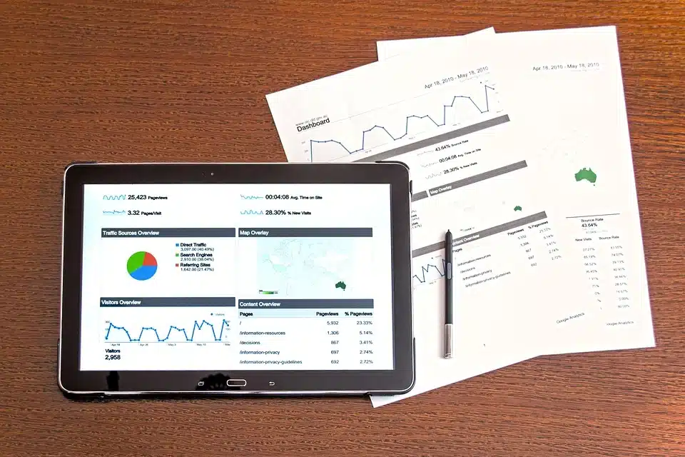
Many business intelligence tools include dashboards, reports, scorecards, and visualizations. These are all ways to bring together all of your company’s data in one place so that it can be easily analyzed and understood by everyone who needs to see it.
Business intelligence can help you make better decisions about your customers and employees, find out where you need to improve your processes or products, see how well your marketing campaigns are working- the list goes on!
Want more detailed information on business intelligence? Check out our detailed blog on what is business intelligence for more information.
What do you mean by data visualization?
Data visualization is a way of presenting data in a visual format. A lot of people think that data visualization is limited to charts and graphs, but it can be much more than that.
Data visualization can include any chart or graph, including maps, timelines, and animations. The key to data visualization is that it allows the reader to see patterns and make connections between different aspects of the data without reading through long paragraphs of numbers or text descriptions.
Companies use data visualization to display sales figures or costs, governments to show crime statistics, and even weather services.
What are the advantages of business analytics tools?
- Business intelligence tools make it easier to make data-driven decisions.
- They help you find patterns in your data, which can lead to insights that can improve your business.
- They can assist with understanding your customers’ needs and how they interact with your product or service.
- They allow you to explore different ways of doing things, which may lead to increased productivity and revenue.
- They provide a way to evaluate the effectiveness of your marketing efforts and other forms of customer engagement.
Want to know more about the tools used for managing data? Check out our blog on essential data analytics tools for more information.
Best data visualization tools for business intelligence
Having a data visualization tool that supports powerful business intelligence operations and helps you make sense of your company’s data is essential. Here are some of the most valuable data visualization tools:
- Power BI
Power BI is a data visualization tool that lets you analyze and visualize data from your business to make more informed decisions. Microsoft developed it, so it’s easy to use and integrates well with other Microsoft products like Excel. It’s also free to use, though if you want extra features like real-time dashboards and cloud storage, you’ll need to upgrade to Power BI Premium.
Power BI has a lot of features that make it an excellent tool for business intelligence:
- Visualize data in charts and graphs
- Create interactive dashboards with drag-and-drop tools
- Analyze historical data over time using line charts, table views, and more
- Enable collaboration on dashboards with others within your organization or across the globe
- Looker
Looker is an analytics platform that allows users to access their data from various sources, including searchable databases and spreadsheets. The product is cloud-based and accessed from any device with an internet connection. It also integrates with other platforms for added functionality.
Want more detailed information on tools covered in data science? Check out our blog on data science tools for more information.
- Klipfolio
Klipfolio is a cloud-based business intelligence tool that allows users to create customized dashboards, scorecards, and reports using live data from more than 40 different sources. These dashboards can then be embedded in web pages and applications for easy viewing by clients or colleagues.
Klipfolio’s most significant advantage is its ability to create custom visuals easily—users can build their charts and graphs without coding knowledge!
- Tableau
Tableau is a data visualization tool used for visualizing and analyzing data. It’s designed to make it easy for anyone to understand their data and quickly create meaningful, interactive reports.
You can also use Tableau to perform ad-hoc analysis or create dashboards with live updating charts, maps, and other visuals. You can also share your work with others by publishing your reports online or sharing them in different formats.
Want more detailed information on marketing analytics? Check out our detailed blog on marketing analytics for more information.
- Chartio
Chartio is a comprehensive business intelligence tool that lets you monitor key performance indicators (KPIs) and keep track of trends over time. It allows you to easily create custom visualizations using existing dashboards or build new ones from scratch with drag-and-drop functionality.
- Google Data Studio
Google Data Studio is a customizable report builder that allows you to create reports and dashboards easily. You can quickly pull data from multiple sources, including Google Analytics, BigQuery, and YouTube Analytics, but you can also connect to other data sources using SQL or REST APIs.
- Metabase
Metabase is a data visualization tool that helps you organize your data into one place and make sense of it. It lets you visualize what’s going on in your company by showing you metrics like revenue per user, customer retention rates, churn rates, etc. You can also see how these metrics change over time so that you can find trends and make decisions based on them.
- Sisense for Cloud Data Teams
Sisense is a business intelligence tool that connects with public and private cloud data sources and can be used on-premise, in the cloud, or as a hybrid solution. It’s quick to deploy, easy to use, and integrates with the most popular business applications, including Salesforce, QuickBooks, and Zendesk. It also has an open API that allows developers to build their connectors.
- Mode Analytics
Mode Analytics is an enterprise-class BI platform designed for modern business needs. It is built on top of Apache Spark and offers real-time access to data from any source. The platform uses machine learning algorithms to provide insights into user preferences; it also includes an ML library that can be used by data scientists and non-technical users who want access to machine learning capabilities without writing code themselves.
- Domo
Domo is a cloud-based business intelligence tool that allows you to access all your data from one place. It offers a drag-and-drop interface, which makes it easy to build charts and dashboards. You can also use the platform’s APIs to connect with other applications. The service includes an analytics engine that supports predictive analytics so that you can make more informed decisions about your business.
- SAP Analytics Cloud
SAP Analytics Cloud is a business intelligence tool that offers many of the same capabilities as Domo, including a drag-and-drop interface and API support. It also allows users to create custom reports and dashboards, which they can export into formats like PDFs or Excel spreadsheets. The service has predictive analytics capabilities and an advanced reporting engine that lets users build visualizations based on their own data sets—it doesn’t require them to work with predefined templates as other BI platforms do.
- Oracle Analytics Cloud
Oracle Analytics Cloud is a cloud-based business intelligence tool that offers a wide range of features and functionality. With Oracle Analytics Cloud, users can create dashboards and reports, capture data from numerous sources, and visualize it in multiple ways. The ability to create interactive dashboards makes Oracle Analytics Cloud especially useful for business intelligence.
Oracle Analytics Cloud also has an impressive list of integrations, including Salesforce, Microsoft SharePoint, and SAP HANA.
- Yellowfin BI
Yellowfin BI is an all-in-one enterprise reporting and analytics platform for business intelligence. It features an intuitive drag-and-drop interface, powerful visualizations, and a wide range of built-in connectors. You can use it to create dashboards that display key performance indicators (KPIs), build reports and spreadsheets, or do data analysis.
- Qlik Sense
Qlik Sense is a business intelligence platform with advanced visualization capabilities based on its self-service BI software. It offers customizable dashboards that allow users to create their own KPIs and set permissions for specific users. It also has a built-in analytics engine that helps you make sense of your data through interactive visualizations like maps and charts.
- D3.js (Data Driven Documents)
D3 is an open-source JavaScript library for manipulating documents based on data. It’s best known for its ability to generate dynamic graphics using web standards like HTML5 and SVG (scalable vector graphics).
Want more detailed information on business analytics tool? Check out our blog on top business analytics tool for detailed information.
Conclusion
Business intelligence can be the difference between success and failure for your business, so it’s worth putting in the effort to understand what BI is and how to use it.
If you’re interested in learning more about BI, consider taking an online course in business analytics at Online Manipal. Our courses are designed by distinguished faculty in Manipal Academy of Higher Education (MAHE) with years of experience working with business intelligence tools, so you’ll know you’re getting the best training. We also offer flexible schedules and a wide range of payment options so that no matter where you are, it’s easy to get started on your career path today!
Key takeaways:
- Business intelligence tools help you visualize your data, which can help you make more informed decisions.
- If you’re not using a business intelligence tool, likely, you don’t have access to the correct data at all times.
- The best Business Intelligence tools will provide you with actionable insights and recommendations based on what they find in your data.
- The best BI tools are easy to use and offer a wide range of functionality, including predictive analytics and advanced reporting features.
Prepare for your next career milestone with us